


Slashed the timeline for a SaaS product MVP by 6 weeks
Company
Trove Recommerce
Year
2023
Timeline
3 months
Role
Sole designer

One of our associates processing footwear inventory in an early version of the MVP
Introduction
This is the story of how I applied my strategic business sense and knowledge of design systems to enable scale for a startup’s product development team.
Background
In the spring following our initial discovery project, Trove leadership revived the project where we would redesign their legacy software as a SaaS product for recommerce warehouse operations. The delivery roadmap was already largely set in place for this module and several others to follow, creating a tight timeline and rigid scope for our MVP designs. I needed to develop a plan to work quickly and efficiently, leveraging our existing research and initial concepts to deliver a usable experience that would scale for multiple modules.
Challenge
Our main challenge was to produce final MVP designs for the Item Inspection module, the flagship module of the SaaS product, and subsequent modules on a tight timeline: just three months to build a strong foundation for the first four modules (with several more to follow).
We needed to balance speed with quality, and I did not want design to be seen as a drag on the engineering team’s ability to deliver functionality. Rather, I wanted my design work to accelerate development, delight our operations users, and set the stage for future scalability.
Solution
Design brief & roadmap
My first step was to create a plan. I wrote up a design brief in Google Docs, detailing my deliverables, milestones, and any blockers/open questions I had.
I visualized my roadmap in Google Slides to communicate easily with stakeholders.
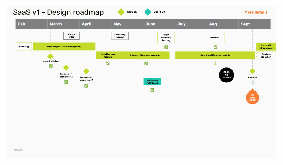
A screenshot of the design roadmap I created in Google Slides
Design system creation
While this redesign was primarily about accelerating our operations workflows, it was also a clear opportunity to uplift the visual design of our operations software.
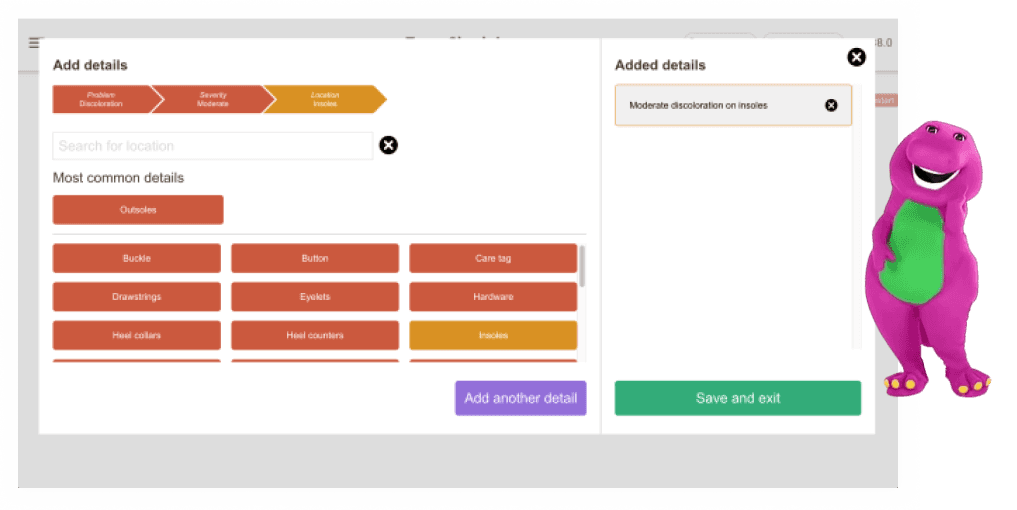
Before the redesign: A look at Trove’s warehouse operations software, which was reminiscent of 90s kids’ favorite purple dinosaur
I aimed to honor and empower our operations users with thoughtful, clean visual design.
It would also serve Trove well to sell a more visually attractive SaaS product; a 2019 study on design impact found that customers are 20% more willing to pay for great design.
To simultaneously achieve my visual design goals while also addressing our time constraints and focus on strategic UX decisions, I proposed implementing an existing design system. After careful consideration, I selected the Material UI design system for a few reasons:
Familiarity: Our engineers were already familiar with React, and the company used Google standards (and Material UI is based on version 2 of Google’s Material design system).
Quick start: The team could begin coding immediately without needing to learn a new design system or coding language, as they’d already been using Material UI (React) for a separate internal tool.
Documentation: Existing Material UI guidelines reduced the need for extensive, custom component documentation.
To minimize rework for visual design improvements, I consulted with lead engineers on the theme-ability of Material UI. They confirmed that editing the centralized theme would require minimal effort.
Given the tight timeline and the ability to re-theme later at a low effort, I made the decision to use “out-of-the-box” Material UI styling for the MVP. (The visuals in this case study are from after we began re-theming; for example, you’ll see the orange and black from Trove’s branding, as opposed to the blue from Material UI.)
I created a Google Doc with a list of starter components based on our prototype, which had already been tested last fall. I sent this forward to the engineers, and they were able to get started right away while I applied the Material UI design system to my existing wireframes and made note of any custom components we’d need to build.
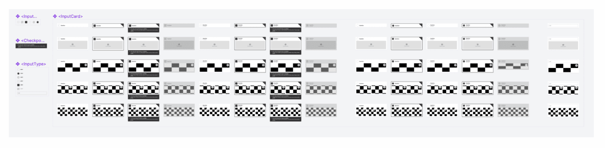
A screenshot of a custom component, the Input Card, and its atomic parts. This component is reused across multiple steps in the flow, a consistency benefiting both developers and users.
Storybook integration
To further streamline our design system strategy, I proposed using Storybook. This tool, which I had previously led a workshop on during my time volunteering with Women Who Code Portland, was also recommended by some of our developers who had experience with it.
Using Storybook enabled our frontend developers to workshop the look and feel of the components I’d designed in more of a sandbox space outside of the actual product codebase.
Templates to scale
It was not only beneficial for common components like text fields and checkboxes to be reusable across the product; per atomic design principles, it’s also extremely useful to define reusable templates, which are components made up of smaller components.
I created a template for the product, one that would meet 80% of our needs for future modules and allow flexibility for the last 20% that would be unique to each module.
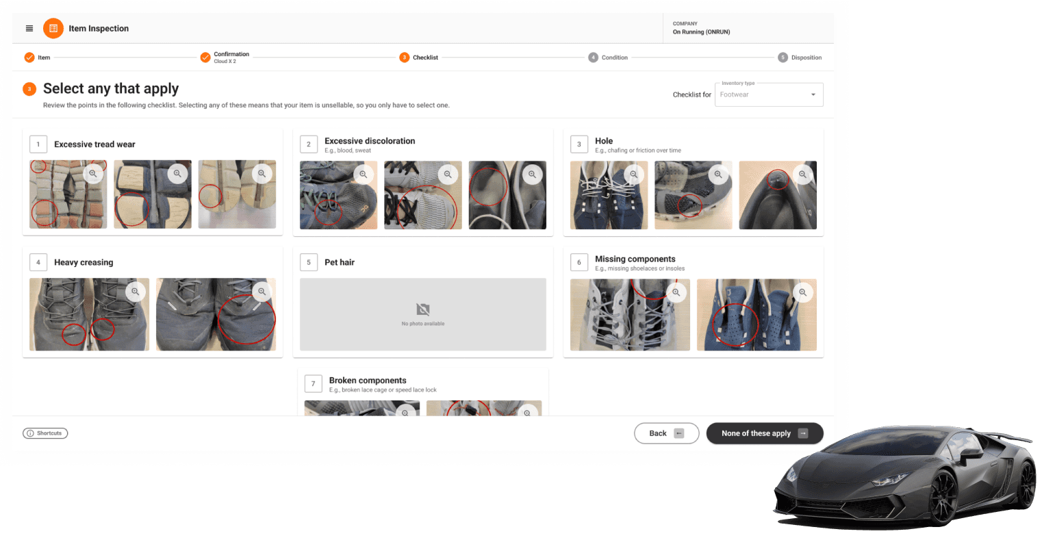
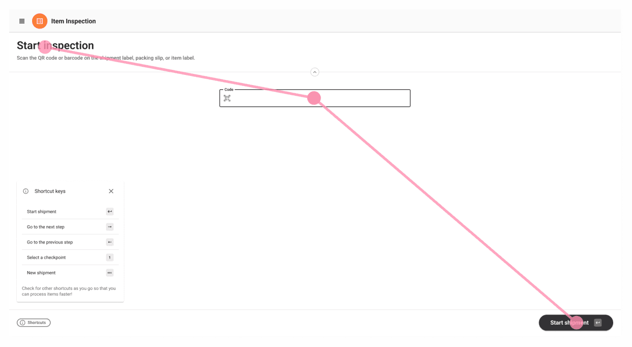
The Checklist step of the Item Inspection module, the flagship of Trove’s new SaaS product. The theme isn’t quite at Lamborghini status, but it is leagues beyond Barney.
This template had a consistent Module Header component, whose structure and contents would remain largely the same but be swapped out with module-specific and dynamic, flow-based data. For example, the Item Inspection module had five steps, but the Move module only had two.
The Bottom Bar component would be consistently placed at the bottom of the screen. This meant that Warehouse Associates could always expect to see contextual information at the top of the screen, and use the bottom of the screen for navigation. Specifically, placing the buttons in the bottom-right corner made it easy for associates to remember to reach for that location as they’re quickly processing items.
The layout composition of the Associate Flow template
I intentionally distributed the composition of the Associate Flow template diagonally across the screen. I took inspiration from traveling in Europe, where public transit is clean and accessible, so we used it often. The interfaces for purchasing transit tickets make great use of screen real estate and offer the user large tap targets.
From prior observations, I knew that our users would become “power users” quickly, as they would have done a single flow 100 times by the end of their first 8-hour shift. So, it made sense to tuck the instructions up in the top-left, where the user could virtually ignore them after the first few rounds in the flow. They could shift their attention to the center of the screen, where unique content would populate based on the flow, brand, and item.
A walkthrough of the Item Inspection module (before we redesigned the Module Header component/removed the sidebar)
While there were also templates for admin-level screens, I focused most of my time on the associate experience, as we would only have a few internal users in the admin UX versus hundreds of associates.
Results
Saved 6 weeks of full-time equivalent (FTE) work for the product development team (an estimated 4 weeks of engineering, 2 weeks of design effort)
Enabled faster development, easier code maintenance, and more consistency
Established a solid foundation for future development
5-star ratings on ease-of-use from operations users (including admins and associates)
30% efficiency increase due, in large part, to a more streamlined UX
She has elevated our designs not just aesthetically, but through thoughtful user research and continual communication, made the UI streamlined in all the right ways for our users and for Trove’s operational efficiency. She also established a cohesive design system that allowed our development team to work with clarity and pace.

Roger Wang
Senior Full-stack Engineer @ Trove
Next steps
Moving forward, we planned to:
Make it easier to onboard other scrum teams to our new design system: We’d create a proof-of-concept for our own design system documentation and usage/contribution processes, reducing reliance on Material UI docs and adding coverage for custom components.
Improve quality and maximize productivity: Explore the full capabilities of Storybook (and other tools, like Anima)
After launch, I ran continuous discovery to capture user feedback and explore enhancement ideas. When I had tickets ready, I’d work with the product development team to fit them into our sprints, further increasing user satisfaction and meeting efficiency KPIs.
Critique
In the spirit of continuous improvement, here’s what I would do differently next time:
Documentation process: Implement a more robust documentation process for custom components and design decisions from the beginning, rather than planning it as a future step.
Design system governance: Establish a clearer governance model for the design system from the start, defining roles and processes for maintaining and evolving the system.
